Accessibility in Design Systems: Why It Matters and Where to Start
When we talk about design systems, we usually think about colors, typography, or components. But one of the most important (and often overlooked) aspects of a design system is accessibility. A truly scalable system isn’t just visually consistent — it’s also usable by everyone, including people with disabilities.
Accessibility (a11y) ensures that your product can be navigated, understood, and interacted with by all users. By baking accessibility into your design system from the start, you create stronger, more reliable components and reduce the risk of one-off fixes later.
Accessibility in Components
Every component you design — buttons, inputs, dropdowns, cards — should be built with accessibility in mind. This means:
- Color contrast
Text, icons, and essential UI elements must meet WCAG contrast ratios. Neutral palettes, brand colors, and tonal surfaces should all be tested against backgrounds to ensure readability. - Focus states
Users who navigate with a keyboard rely on visible focus indicators (like outlines, highlights, or underlines). Every interactive component — links, buttons, form fields — should have a clear, consistent focus style that is always visible. - Hit areas
Interactive components should have touch-friendly sizes. Small buttons or icons should have extra padding so they’re accessible on both desktop and mobile. - States and feedback
Components should clearly communicate their state (hover, pressed, disabled, error, success). Relying only on color is not enough — pair it with icons, text, or patterns.
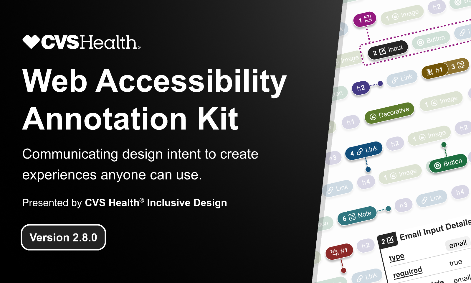
Get the free annotation kit from CVS Health
Make your designs more inclusive from the start with the free
Web Accessibility Annotation Kit by CVS Health. This Figma resource helps you add clear annotations to your components, ensuring developers have the guidance they need to implement accessible interactions, focus states, and semantic structure.
Adding Annotations for Developers
Accessibility isn’t just a design decision — it needs to carry through into development. One of the most effective ways to do this is by annotating your design files so developers understand the intent behind each choice.
Annotations can include:
- Keyboard behavior: Add notes like “Tab order should move left to right” or “Pressing Escape closes modal.”
- ARIA guidance: Suggest when components may need ARIA labels, roles, or attributes.
- Interaction details: Clarify hover vs active vs disabled states so developers don’t have to guess.
By adding these small annotations directly into your Figma or Sketch files, you bridge the gap between design intent and implementation. This prevents accessibility features from being lost during handoff.
Accessibility in a Website
Beyond individual components, accessibility also applies to the overall website experience. This includes:
- Semantic structure
Headings, lists, and landmarks (like<header>,<nav>,<main>) help screen readers navigate content quickly. A proper heading hierarchy is just as important as visual design. - Keyboard navigation
All functionality should be accessible via keyboard — menus, modals, forms, and carousels included. If a user can’t reach it without a mouse, it’s not accessible. - Readable typography
Use legible font sizes, generous line height, and enough spacing between interactive elements. This helps not only users with vision impairments but also anyone on smaller screens. - Motion and animation
Provide alternatives or respect system settings for reduced motion. Animations should support meaning, not distract or cause discomfort.
Why Accessibility in a Design System Is a Superpower
When you embed accessibility rules into your design system, you scale them automatically across every product and page. Instead of fixing accessibility case by case, you:
- Build accessible by default components (buttons, inputs, modals, etc.).
- Provide consistent focus states and contrast ratios across the system.
- Document accessibility guidelines so designers and developers share the same rules.
- Save time by not reinventing solutions for every new feature.
Quick Wins You Can Implement Today
- Define accessible color tokens (pass WCAG AA at minimum).
- Add focus states to every interactive component in your library.
- Standardize text sizes and line heights for readability.
- Ensure buttons, inputs, and icons meet minimum touch target sizes (44x44px recommended).
- Write accessibility notes in your design system documentation.
Final Thoughts
Accessibility isn’t an afterthought — it’s a foundation. By including contrast rules, focus states, semantic structure, and clear interaction patterns directly into your design system, you ensure that every component and every website page is more inclusive, usable, and future-proof.
👉 Start small: check your colors, define focus states, and test your components with just a keyboard. You’ll quickly see how accessibility improves not only compliance but also overall user experience.