Start Building Your Components with Label Text Styles as a Guide
When building a design system, it’s easy to jump straight into components like buttons, inputs, or cards. But if you want your system to feel consistent, scalable, and easy to maintain, the best place to start is actually text styles — specifically your label styles and their line heights.
Why Labels Matter First
Labels are everywhere in an interface. They show up in:
- Buttons
- Form inputs and dropdowns
- Tags and chips
- Avatars and metadata
- Navigation items
Since they’re so widely used, labels act as the
building blocks of your entire component library. If they’re well-defined, everything else falls into place. If they’re inconsistent, your UI will feel messy and hard to scale.
Labels + Line Height = The Grid of Your Components
It’s not just about font size — line height is what really sets the rhythm of your components. A good line height ensures that text is legible and that spacing between elements feels balanced.
In the example above, label styles are defined with both size and line height:
- Label - XL: 18px / 28px
- Label - L: 16px / 24px
- Label - M: 14px / 20px
- Label - S: 12px / 16px
- Label - XS: 11px / 16px
This creates a consistent vertical rhythm that can be reused across components.
Preview
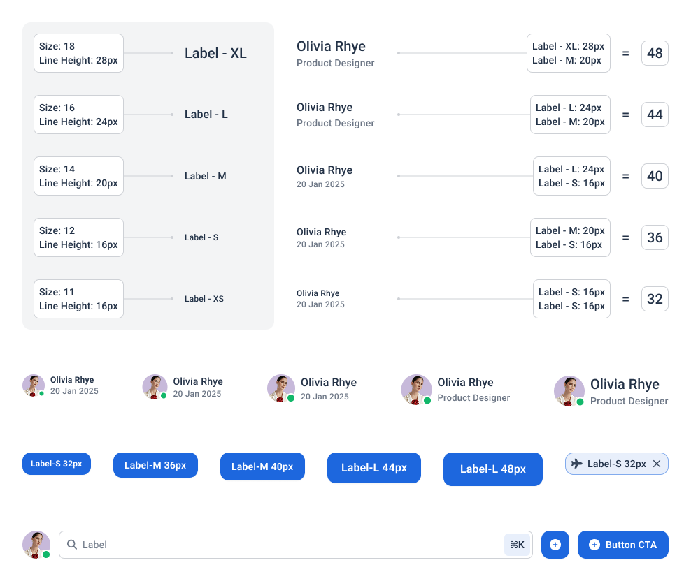
Building Components on Top of Labels
Once you’ve set up your label styles, you can start stacking them into real components. For example:
- Avatars → Combine a label (M or S) with an image, using line height to keep spacing consistent.
- Buttons → Place a label inside a container. The line height defines the button’s height automatically, making them consistent across variations.
- Chips/Tags → A label (S or XS) plus padding = clean, scalable tokens for filters or categories.
- Metadata → Pair labels of different sizes (e.g., name in L + date in S) to establish hierarchy.
By reusing label styles, your components inherit consistency automatically, without needing to redefine text for each one.
Pro Tip
Think of your
label styles + line heights as the "grid system" of your typography. Just like you wouldn’t design a layout without a grid, you shouldn’t design components without a clear text style foundation.
Where to Start
- Define your label sizes (XS → XL) with consistent steps.
- Assign line heights that keep them legible and aligned to your vertical rhythm.
- Create variables for each style in your design tool (Figma, Sketch, etc.).
- Start building simple components (buttons, tags, avatars) using only those label variables.
- Watch how consistency carries forward into more complex patterns.
Final Thoughts
Starting your design system with
label text styles and line heights may feel small, but it has a huge impact. These decisions create the foundation for every button, chip, and input you’ll design later. By setting this base first, you’ll save yourself from endless alignment headaches and ensure your components feel unified right from the start.
👉 Try this approach in your next project — define your label styles before anything else, and you’ll notice how much smoother the entire design system comes together.