Free Figma Color Palette System (HSB & HSL)
Designing with color can be tricky — especially when you need a consistent system that works across text, backgrounds, surfaces, and brand elements. To make this process easier, I created a Figma color palette file based on simple maths that’s fully linked with variables and based on HSB (Hue, Saturation, Brightness) and HSL (Hue, Saturation, Lightness) color models.
This file is designed as both a
learning resource and a
practical toolkit. You can use it to quickly build palettes for branding, UI, and digital products without getting lost in trial-and-error.
Why HSB and HSL?
Color models like HEX or RGB are great for developers, but not very intuitive for designers. That’s where HSB and HSL shine:
- Hue (H): Defines the base color family (red, green, blue, etc.).
- Saturation (S): Controls how vivid or muted the color looks.
- Brightness (B) in HSB: Adjusts the overall intensity of light.
- Lightness (L) in HSL: Balances between black and white, giving you better tonal control.
By working in these models, you can think about colors more like a designer — shifting hues, adjusting intensity, and creating light/dark scales that stay consistent.
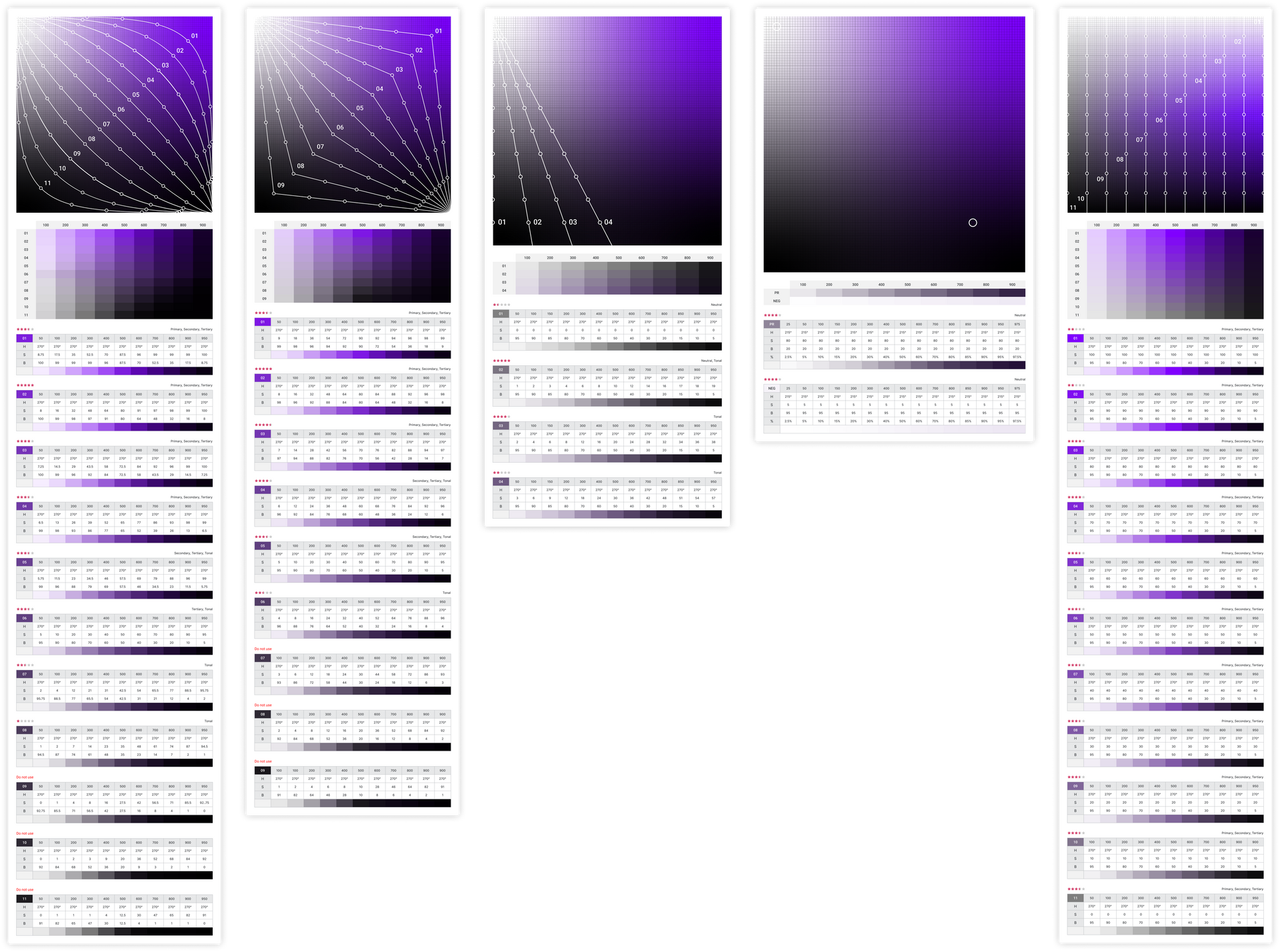
What’s Inside the Figma File
The file is organized into pre-built color palettes and editable variables so you can quickly customize them for your projects. Here’s what you’ll find:
HSB Palettes
- Organic, Neutral, Tonal, and Linear scales.
- Smooth gradients based on brightness and saturation.
- Great for exploring strong brand colors or expressive accents.
HSL Palettes
- Linear scales for building balanced tones.
- Works especially well for UI surfaces, shadows, and accessibility-friendly contrasts.
Linked Variables
- Every color is connected to a variable in Figma.
- If you adjust the hue or saturation, the entire palette updates automatically.
- Perfect for experimenting without breaking consistency.
Preview
How You Can Use It
This system isn’t just a set of swatches — it’s a framework for building a scalable design language.
- Brand Palettes
Start with a core hue, then expand into lighter and darker variations. This gives you primary, secondary, and accent colors that feel unified. - Neutral Palettes
Essential for text, icons, and backgrounds. Neutral scales are built to balance against stronger brand colors while keeping readability high. - Tonal Palettes
Designed for surfaces, elevations, and states (hover, active, disabled). These tones ensure your UI feels cohesive and layered without relying only on opacity tricks.
Why This File is Useful for Designers
- Saves time when building design systems from scratch.
- Helps avoid random or inconsistent color choices.
- Works as a teaching tool if you want to understand HSB/HSL better.
- Easy to hand off to developers since it exports clean HEX values.
Get Started
Download the free Figma file, duplicate it into your workspace, and start experimenting. Adjust the hues, play with saturation levels, and see how the linked variables update your entire palette instantly.
With this system, you’ll be able to create
scalable, accessible, and beautiful palettes for your next project.